Google’s Fusion Tables is “an experimental data visualization web application to gather, visualize, and share larger data tables.” One of its highlighted features is the ability to create an intensity map by merging two location data tables into one data set.
To begin, I need some data to visualize. In this example, I have downloaded the Excel file African Economic Outlook 2012 from the OECD website and copied two columns and saved it in comma-separated values (SCV) format, like this:
Country,GDP based on PPP valuation (US $ Million)
Algeria,255344
Angola,115277
…
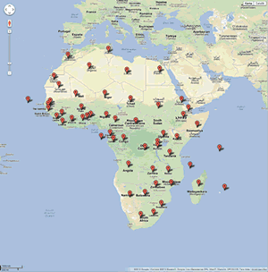
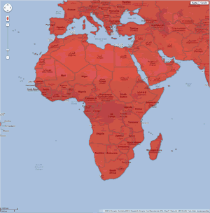
The first column Country contains country names, and the second column GDP based on PPP valuation (US $ Million) contains economic data. Fusion Tables geocodes the country column for me, and the result is a map with markers for each of the countries (map 1). I can click on each marker and get information about the country and its GDP. The next step is to download the file world country boundaries and import it into Fusion Tables. This table contains polygon boundaries for all countries in the word (map 2).
| Map 1: African countries and their GDP | Map 2: World country boundaries |
|---|---|
 |
 |
In the final step, I merge these two tables to generate a single visualization that includes both sets of data. To find the story in the data, I apply a gradient green fill color to the GDP column. The map tells us that Egypt, South Africa and Nigeria are the top three largest economies on the continent in the year 2011. We can also see that Western Sahara and Somalia are missing data by their reddish color.